Scrubs
The goal of this project was to improve communication between nursing staff and providers by building a HIPAA compliant messaging application.
My Role: UX & UI Designer
Timeline: 3 weeks
My Team: Esther. Nick, Nafia
Tools: Figma, FigJam, Google Office

Understanding the Issue
Issues between nurse and doctor communication is a highly researched area and has a huge impact on patient care.
“According to research conducted by The Joint Commission (TJC), almost 60% of medical errors are the direct result of a communication breakdown, such as a failure in communication between doctors and nurses(HIPAA Journal, 2021)”
Nurses need an easier way to communicate with fellow coworkers and doctors. They find that it is difficult to reach doctors in the middle of the night, and often feel that it is discouraged to call the doctors for fear that they will be woken up for non urgent issues.
How might we help improve nurse to doctor communication, while also creating an experience that is secure and easy to use?
Digging into the Problem
My team and I conducted 5 user interviews with healthcare professionals at local hospitals. Here were some of the insights.
Illustrations by Open Peeps by Pablo Stanley
Coming to the solution
We used a couple of key insights when considering the solution.
Insight #1 - Nurses were afraid to call the doctor and wake them up in the middle of the night
Insight #2 - All staff had their own smart phones
Insight #3 - Healthcare staff preferred texting over calling
Based on these insights, we decided to design a HIPAA compliant chatting system. The app can be safely used on personal devices and the text feature allows for a less invasive way to notify doctors in the middle of the night.
Low to High Fidelity Designs
We jotted our ideas down with low fidelity sketches and made digital prototypes to start user testing.
Made with Renderforest.com
Meet Naomi
Based on the interviews we created a user persona for Naomi.
Coming to the solution
We brainstormed a list of features for the app, narrowed down the top 7 by group voting and chose the top 3 features by mapping it onto a priority matrix.
Priority matrix
Above image are the mid fidelity prototypes
Above image are the high fidelity prototypes
Usability testing
We tested the prototypes with 5 users and identified some areas for improvement.
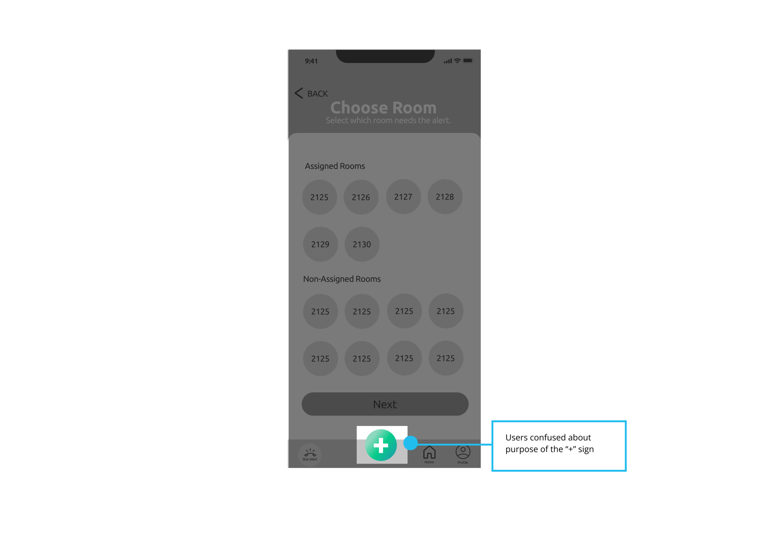
Insight #1- Users found the plus sign in the nav bar to be confusing. Users were not sure if it was for starting a new message.
Solution for insight #1- We changed the plus sign to a paper icon and it became more clear to users that it was for starting a new message.
Insight #2- Users were having trouble locating the assignments in the profile section.
Solution for Insight #2- We moved the assignments to its own button on the bottom menu.
Insight #3- Users were scrolling through the different alerts and finding that the one they used most frequently was Code Blue.
Solution to Insight #3- We made Code Blue the main alert and had the secondary alerts on a scrollable carousel.
Next Steps
With more time, our future plans include a second round of usability testing and understanding doctors as our users.


