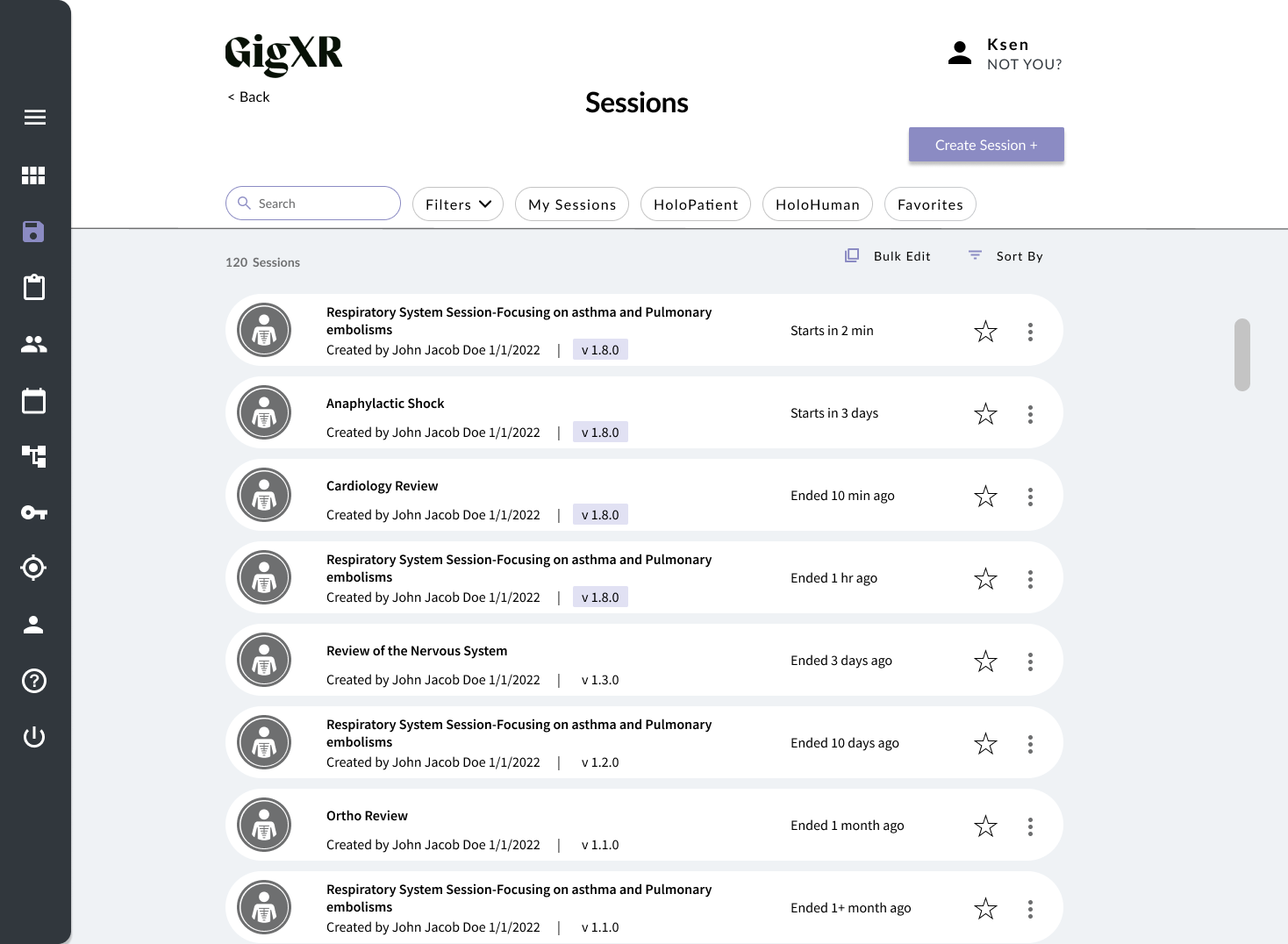
Sessions List Redesign
The goal of this project was to improve the search and find experience of our sessions/group.
My Role: UX & UI Designer
Timeline: 1 month
My Team: Designer, product manager, VP of product, lead developer
Tools: Figma, FigJam, Google Office

Understanding the Challenge
To start an XR session, GigXR users needed to either locate an existing session/group or create a new one in the online portal.
User feedback revealed that many users struggled to locate a specific session/group they were searching for, often resulting in them creating a new session/group each time they wanted to start an XR session. This led to an excessive number of one-time-use sessions accumulating in the database.
Through user feedback, two key pain points emerged:
List vs. Card Layout: Users struggled to scan and differentiate between sessions in the card-based layout.
Menu Bar + Filters Design: Users had trouble with filtering options, navigating the menu, and quickly sorting sessions.
Based on these challenges, the project was divided into these 2 core focus areas.
Above is a view of the previous list of sessions.
Problem 1: List vs Card Layout
The Problem
Users reported difficulty when scanning the sessions page due to:
Insight #1 Cut-off Session Titles: Titles were truncated in the card design, making it harder to distinguish between sessions.
Insight #2 Lack of Information: The information on the cards lacked labels or information, making it hard to understand what the date time was for.
Meet Sarah
Process for Going from Card vs List
I created three versions to refine the card design:
V1: Still used the old card layout, but reorganized the information present on the card, and introduced 2 lines for the title. This was a slight improvement from the current cards, but via user testing found that this was still not enough space for the title. (see image below)
V2: Transitioned from card to list format. However, user feedback indicated that the title needed more emphasis and color was distracting. (see image below)
V3: For the final version we bolded the session titles, secondary information moved below the title, and added key details (e.g., start time, version type) to the left and right columns, and removed color from the icon. Via user testing was able to find that we could fit the most information in this list format and users were easily able to scan information. (see image below)
Insights & Solutions
Insight #1 Cut-off Session Titles: Titles were truncated in the card design, making it harder to distinguish between sessions.
Solution to Insight #1: This list format made sessions easier to distinguish and improved the overall user experience.
Insight #2 Lack of Information: The information on the cards lacked labels or information, making it hard to understand what the date time was for.
Solution to Insight #2: This list format created more space for more information like labels and more buttons.
Research Insights
To determine whether to keep the card layout or switch to a list, I analyzed the pros and cons:
Cards
Pros: Better for showcasing image-heavy content.
Cons: Less scannable, limited space for titles.
Lists
Pros: Easier to scan, reduces cognitive load, displays full session titles.
Cons: Less visually engaging.
Decision: Based on the research, we transitioned to a list format to improve scannability and ease of use.
Above you can see the previous sessions card. You can see that the session title is cut off, and the logo to the left takes up most of the card space.
Problem #2: Menu Bar + Filters Redesign
Users faced challenges with filtering and sorting sessions due to:
Inefficient Filtering: Filters only allowed single selection per category.
Hidden Search Bar: Users wanted a persistent search function.
Confusing Layout: The menu bar combined clickable and non-clickable elements, leading to frustration.
Insights & Solutions
Key insights informed the redesign:
Insight #1: Users struggled to quickly toggle commonly used filters, and found it inconvenient to have to open up the filter menu.
Solution to insight #1: Introduced filter chips for commonly used filters, allowing quick toggling.
Insight #2: There was no search bar present in the previous website menu bar.
Solution to insight #2: Added a persistent search bar to the top of the page.
Insight #3: The “Sort by” and “Filters” options were combined, creating confusion.
Solution to insight #3: Separated “Sort by” and “Filters” into distinct sections.
Insight #4: The filters modal covered the entire page, disrupting navigation.
Solution to insight #4: Redesigned the filters menu to be more compact, allowing users to see the page while filtering.
Insight #5: The purpose of the buttons were unclear to users because of the labeling or lack of labeling, including the action button and the “+” button to the right.
Solution to insight #5: From testing, “Bulk Edit” was more intuitive than “actions,” so the button label was updated. From research found that this button is lower in button hierarchy, and placed into secondary menu. Added a label to the plus button “Create Session +” to give more context for button purpose.
Usability Testing
The redesigned menu bar and filters underwent usability testing, revealing several key insights:
Improved Searchability: The persistent search bar helped users find sessions more efficiently.
Faster Filtering: Filter chips reduced the need to open the filters menu repeatedly.
Enhanced Clarity: Separating “Sort by” and “Filters” minimized confusion.
Simplified Layout: Users preferred the cleaner, more intuitive menu bar with intuitive button labels and heirarchy.
Challenges
One of the main challenges was the limited usability testing.
The other challenge was having to stay within the current UI kit bounds for the designs.
Next Steps
Conduct direct user research post-launch to gather additional feedback and refine the design.


