Extended Reality Menu
As a novice UX/UI designer, I was very intrigued coming into this start-up and diving into the world of XR (Mixed Reality). This was my first time designing something that wasn’t 2D and I was challenged and stretched to think and design in a different way.
Some of the challenges I faced with this project included 1. the caveat of not being able to have direct communication with the client, 2. only being able to user test within the team with no measurable success, and 3. having to design within the color and button constraints of the MRTK 2 kit.
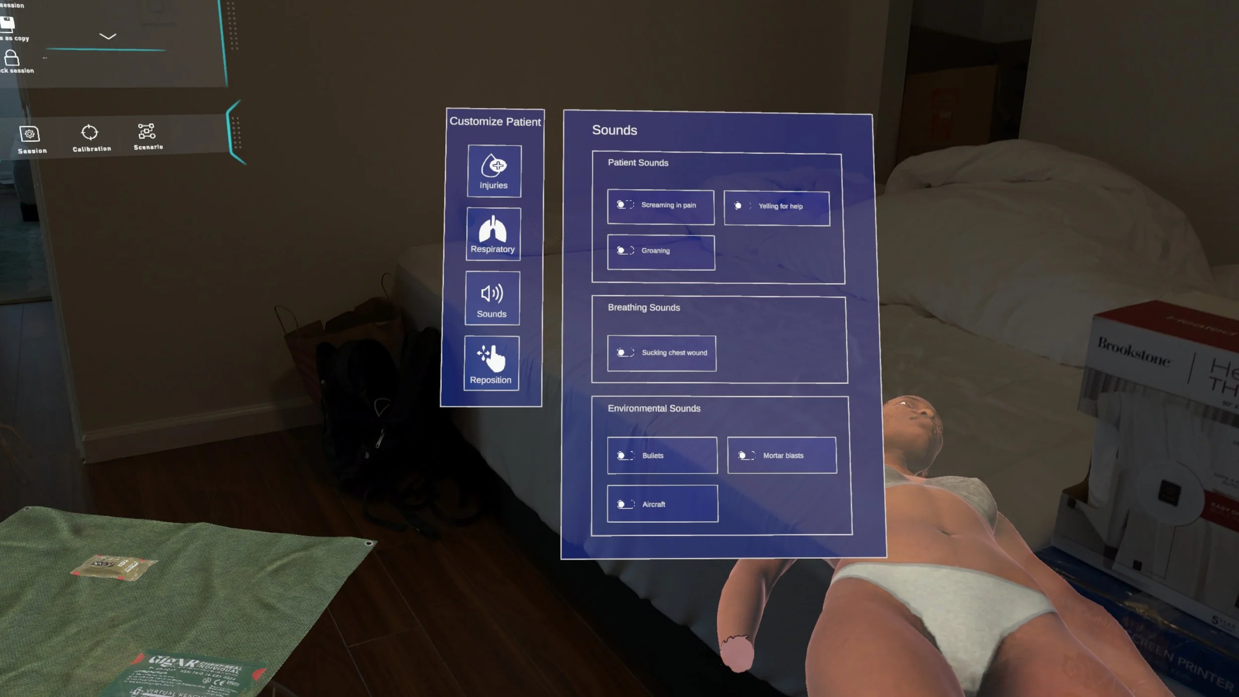
Menu prototype in Figma
Menu prototype in the Hololens
The challenge was to create an extended reality hand menu for an app on the Microsoft hololens using the MRTK 2 components kit. This hand menu would allow the instructor to be able to control and inject complications into the patient scenario in real time as the student is attempting to treat the patient.
Understanding the issue
Client is looking for an XR product that could be used to teach combat casualty care and train staff with hyper realistic patients in warzone. This XR product would provide hyper realistic patients with gruesome unfathomable injuries such as face blasts, missing limbs, large amounts of blood.
Meet our government client
Some of the challenges I faced with this project included..
Learning how to design for the first time in a 3D space.
Keeping in mind haptics and proprioception of the designs, and not being able to control or change gesture recognition or sensitivity (this is dependent on Microsoft).
The caveat of not being able to have direct communication with the client and not being able to form a relationship with client.
Low budget project where there was no time allotted for reiterations and QA with developers.
Having to design within the constraints of MRTK 2 kit, and being unable to deviate from the buttons and colors used in this kit.
Only being able to user test within the team, and not being able to measure success of app.
Challenges
Here were some of the insights and problems found from interviewing the government client about their current combat casualty care.
No realism in training with manikins.
Difficult to mimic and show gruesome injuries to students in standard training environment.
Wanting to decrease costs of purchasing manikins.
Wanting to train students to act quickly in gruesome situations, and have the students practice on a patient that has changing complications.
Instructor wants to be able to inject complications and control the simulation in real time.
Instructor wants to be able to control bleeding, sounds, injuries, and breathing.
Diving into the Problem
I used a couple of key insights when considering the solution.
Insight #1 - Instructor wants to be able to inject complications and control the simulation in real time.
Insight #2 - Instructor wants to be able to control bleeding, sounds, injuries, and breathing.
Based on these insights, I decided to create a hand menu that is quickly accessible to the instructor during the simulation.
Feedback from users
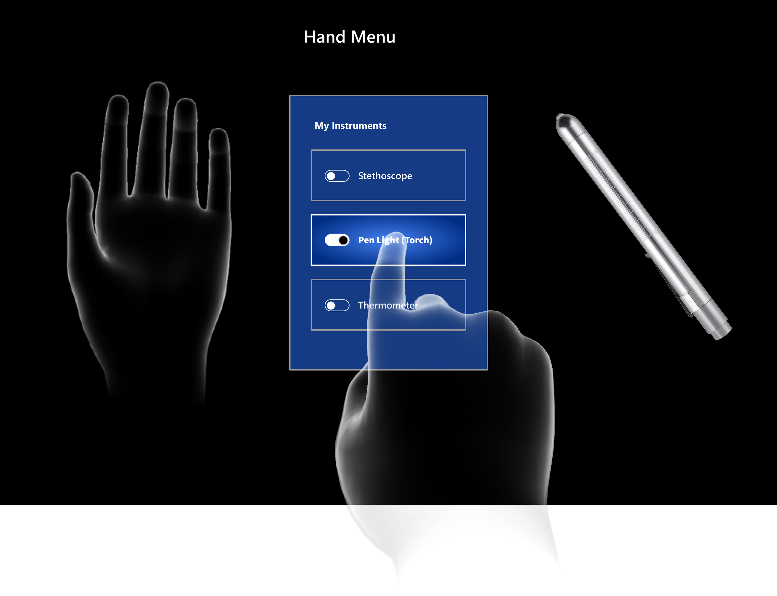
This is our current hand menu. You can see that it only has menu items for “My Instruments” and does not have room for growth in the menu. It’s more of a control panel than a menu.
Analyzing current designs
The issue at hand was to create a new main menu, and controls panel that would contain more controls for the instructor.
The second issue was to remain within the constraints of the MRTK (Microsoft took kit) 2 kit, I was only allowed to use the existing buttons, controls, colors within this kit.
Identifying issues
Usability Testing
Insight #1- Problem
Instructor wants to be able to pull up menu and inject complications and control the simulation in real time. Our current menu only had one screen and did not accommodate for more space.
My solution was to have 2 parts to the menu. A main menu to accommodate for different sections, and a separate controls panel that pops open next to the main menu. The menu would also have a lock feature so that user would not have to keep hand up to view menu.
Insight #1 - Solution
Insight #2 - Problem
Instructor wanted to be able to control bleeding, sounds, injuries, and breathing. Our current menu only contained “Instruments.” This current menu would not allow for adjustments to bleeding, breathing, or sound effects.
Solution for Insight #2- Users would have easy access to adjust bleeding rate, respirations, sound effects, and repositioning of patient all contained in one menu.
Insight #2 - Solution
What I Learned
I was stretched and challenged in so many ways during this project.
-I learned to focus on the flow of the product and usability, vs focusing on the UI because I was unable to control any of the UI in this project.
-I learned to compare and contrast and did a lot of competitive analysis to see how other VR/XR headsets worked.
-I learned how to design for developers, so that the transfer of designs from Figma to Unity would be easier.
-I also learned a lot about business needs and goals, and how that can often times trump the quality of the final product.
Next Steps
Moving forward, there a few things I would want to change and improve..
-I would want to be more involved in the QA process. At the end of the project, I found that there were design decisions that were made without my input and this was quite frustrating. I found that there are companies that do not always value design input and make decisions out of my control. If I could be more part of the QA process moving forward I think we would have a much more cohesive product.
-I would want to explore different UI ideas. I had to remain within the style-guide from the Microsoft toolkit and would love to be able to go beyond this in the future.


